THE 8TH CLIMATE
One of my design classes was based on a semester long project that involved curating all of the design and marketing around a biennale—essentially creating a brand identity for the exhibit. I chose the 11th Gwangju Biennale: The 8th Climate (What Does Art Do?). The 8th Climate refers to a state, or inter-world, one might reach using imaginative capacities. In essence, it is an imaginative plane that transcends the originally proposed 7 earthly climates. This is my portfolio, built using Adobe Illustrator, Photoshop, Premiere, and InDesign along with HTML/CSS/JavaScript!
I. POSTER
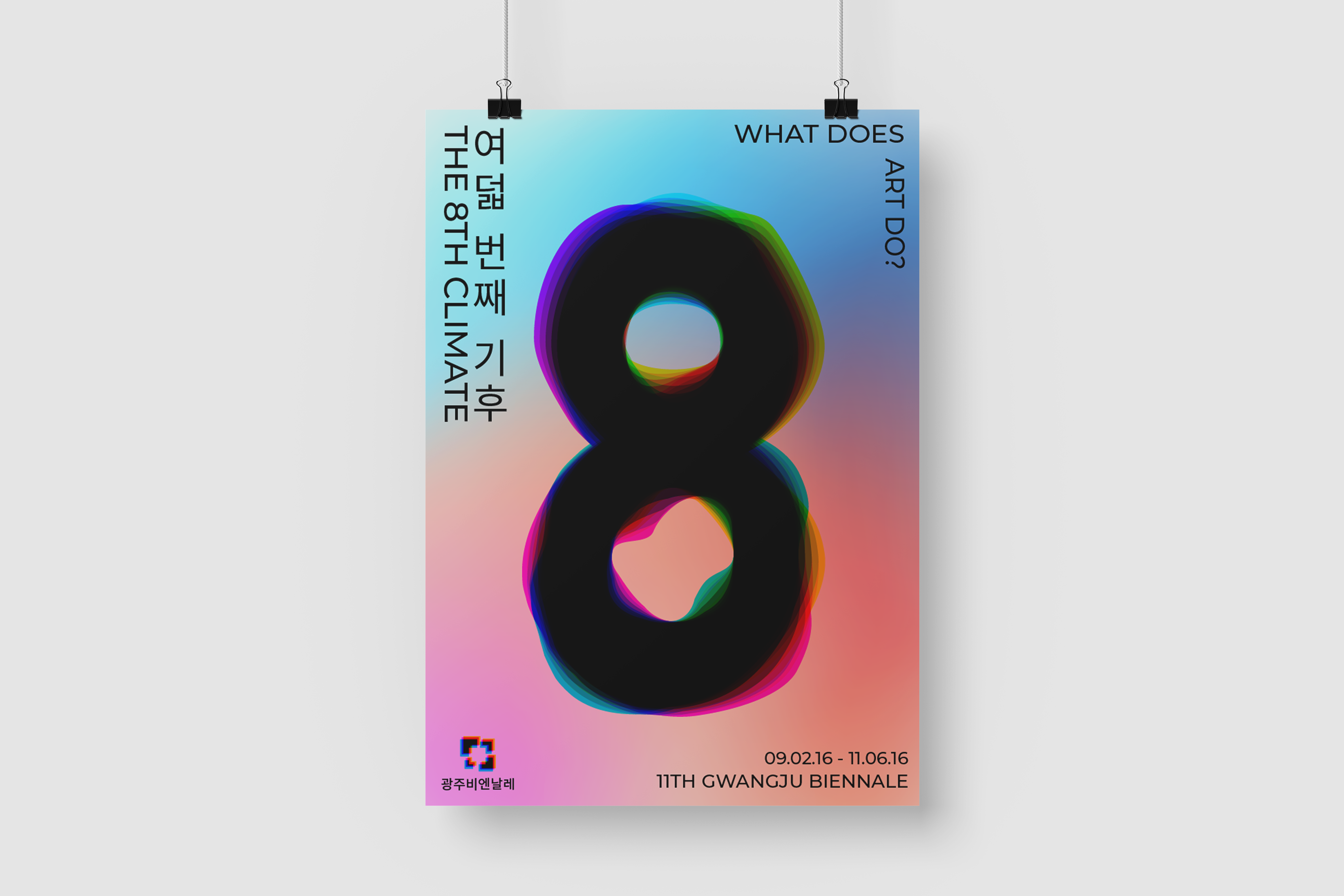
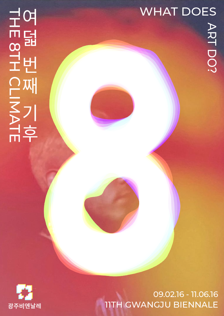
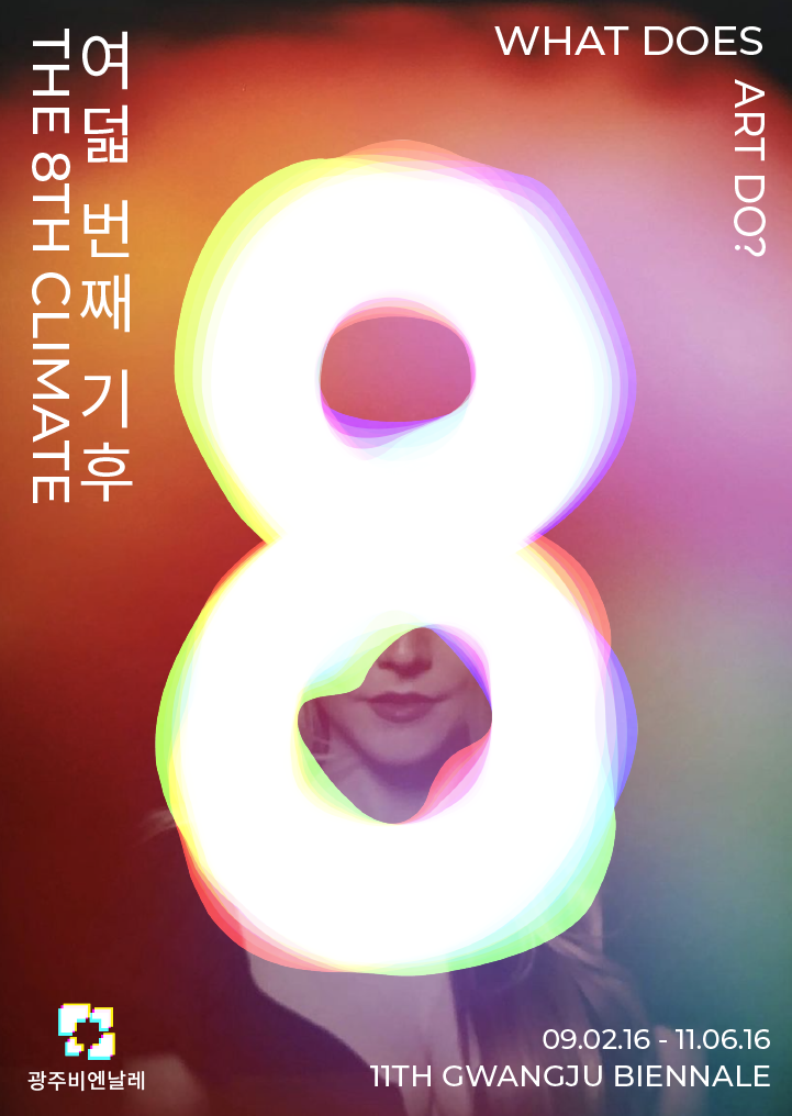
The first piece was a poster. I went back and forth between projects a lot, and even though the poster was assigned at the beginning of the semester, I found myself still tweaking it throughout the semester in order to create a more cohesive brand.
These are some of my first designs. In the first iteration, I drew inspiration from topographical maps in order to incorporate the base "earthliness" of the original 7 climates, but abstracted for the 8th climate. However, I ended up scrapping this and focusing more on the imaginative aspect, and started turning more towards gradients (while keeping a sense of topography within the 8 icon).


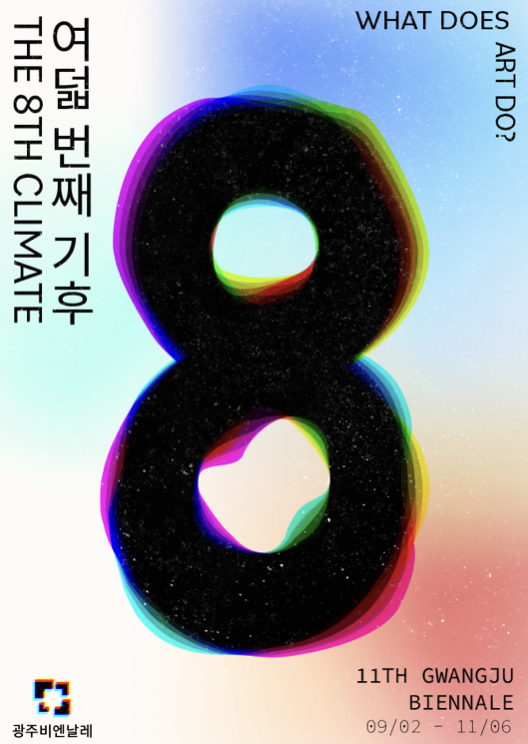
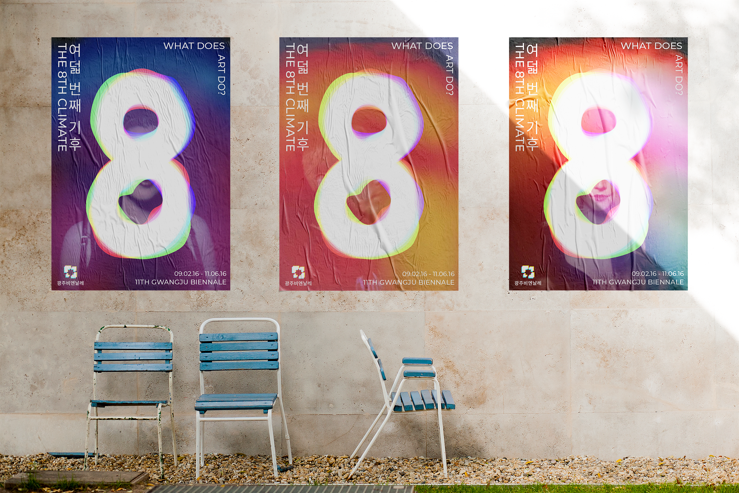
These are some of my final iterations. My inspiration really struck after discussing with my professor potential overarching themes. We decided that auras were a perfect metaphor for the 8th climate, as they were both these extra/imaginative planes that transcended the Earth/humans. Using auras as my base design idea, I created a set of unique mesh gradients. The idea for the poster campaign would be to have various gradient background for posters to convey this idea of unique auras.
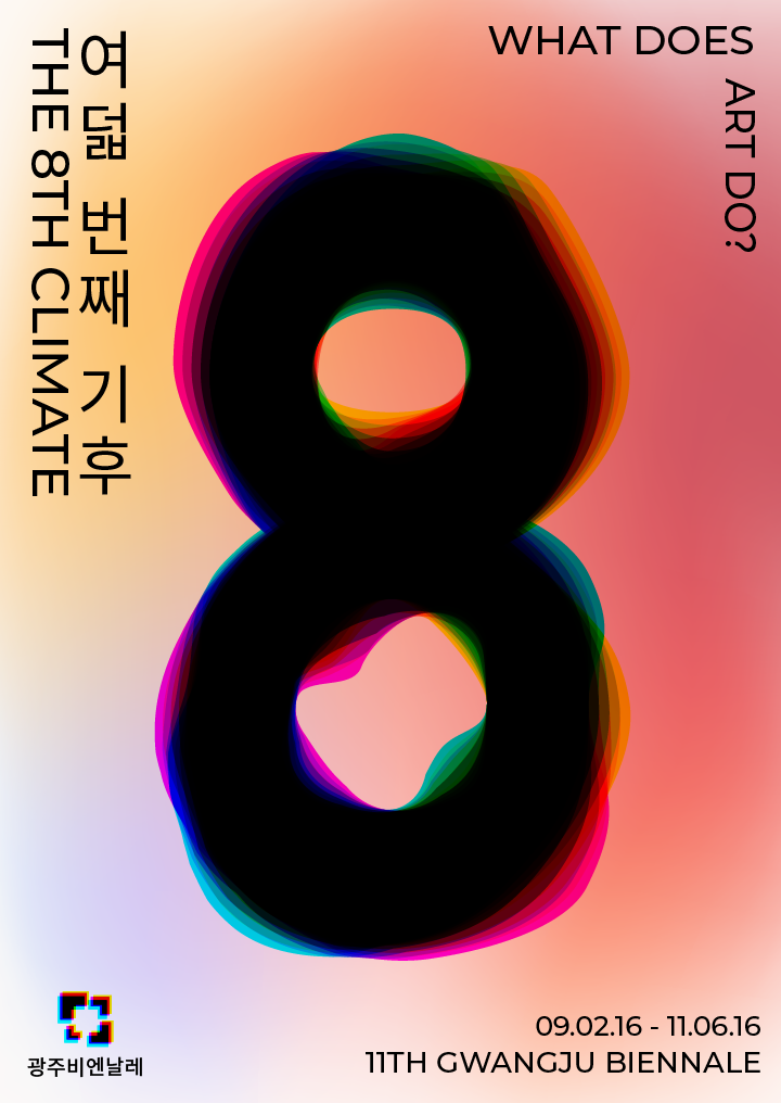

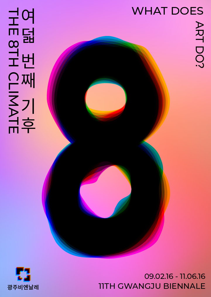
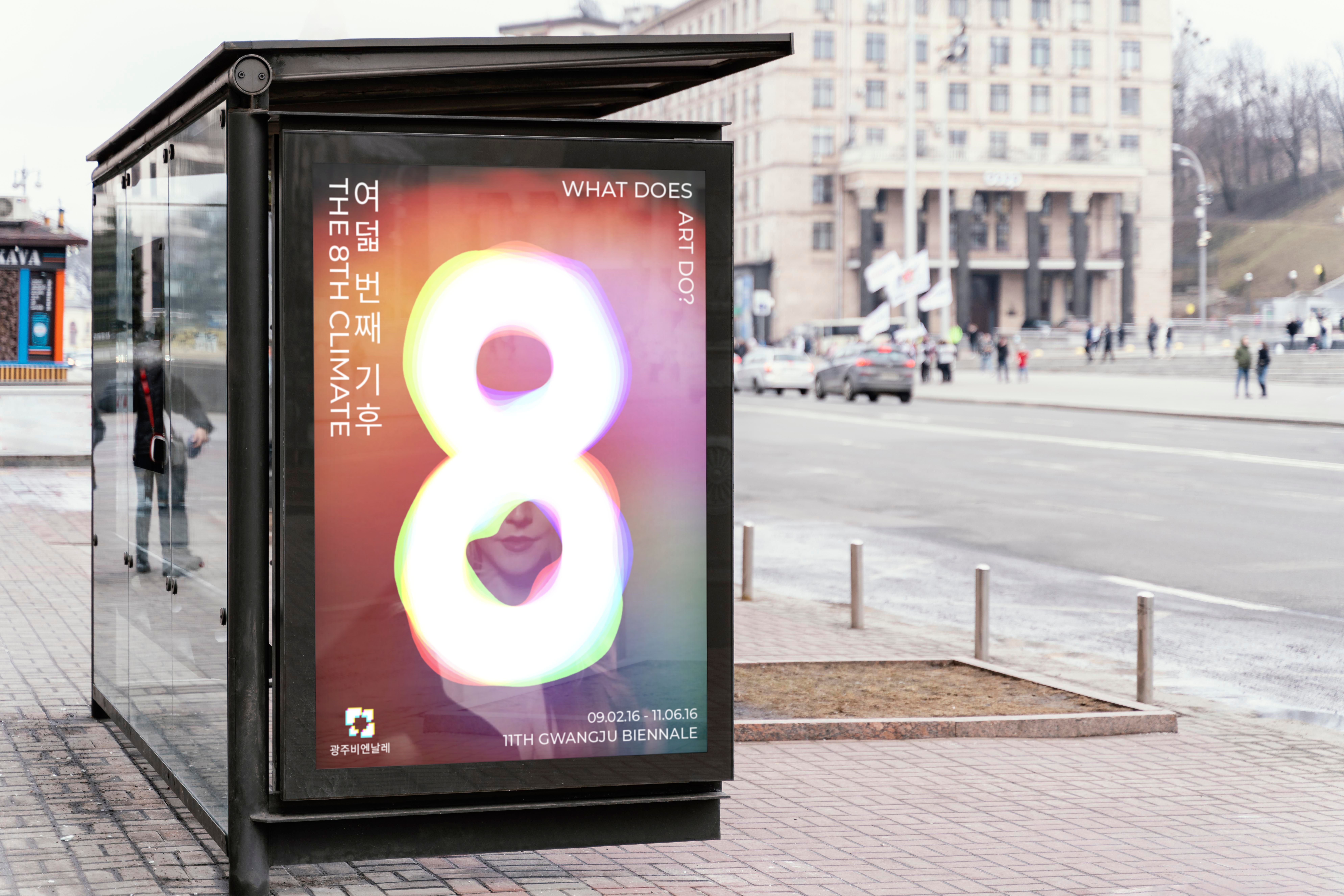
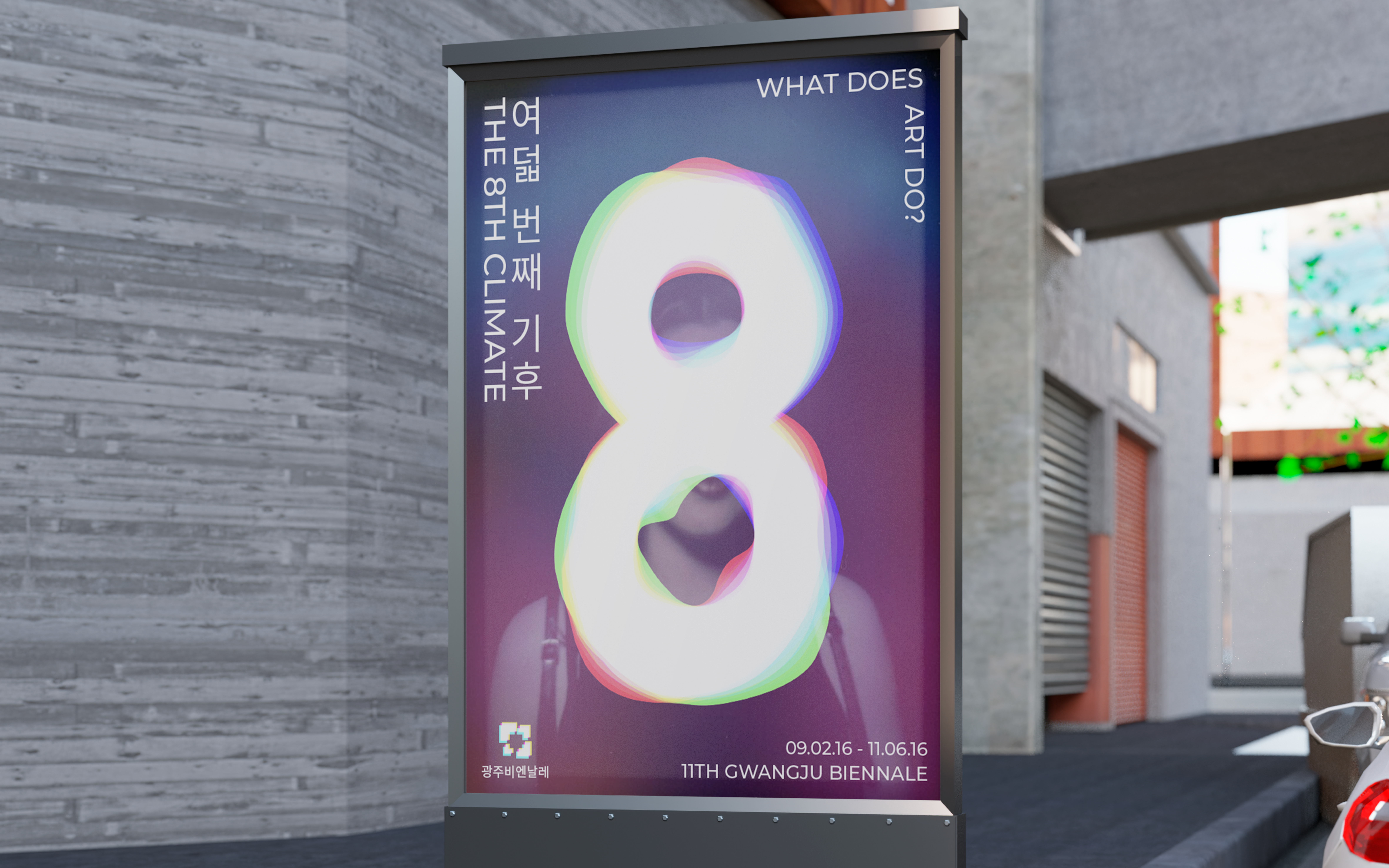
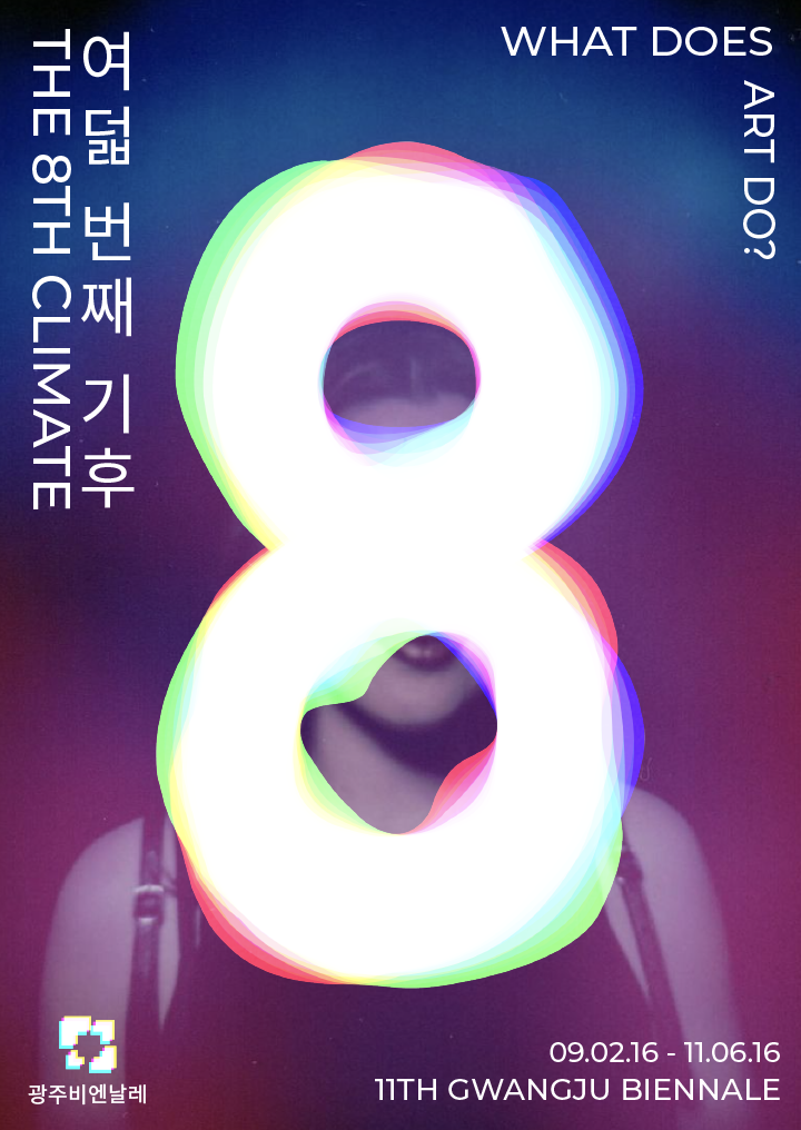
Later on, I went back and added actual aura photographs as backgrounds to bring in a more human elememt and hone in on the design idea. It also gave me a chance to play with using white text (since most of my other pieces used white text).
II. MOTION PIECE
The second part of the project was a motion piece. Luckily, I had found the background music early on that gave me a space/other-worldy feel. My goal for the motion piece was to illustrate how the 8th climate is an extension of the earth. I achieved this by starting with clips of physical landscapes (and added little background sounds such as birds chirping and fire cackling) and then transitioning to abstract imagery. The transition point was marked by the eye opening, which in essence was the "opening of the imagination." Finally, I added some moving gradients at the end of the video in order to tie it back to my posters.
III. PUBLICATION
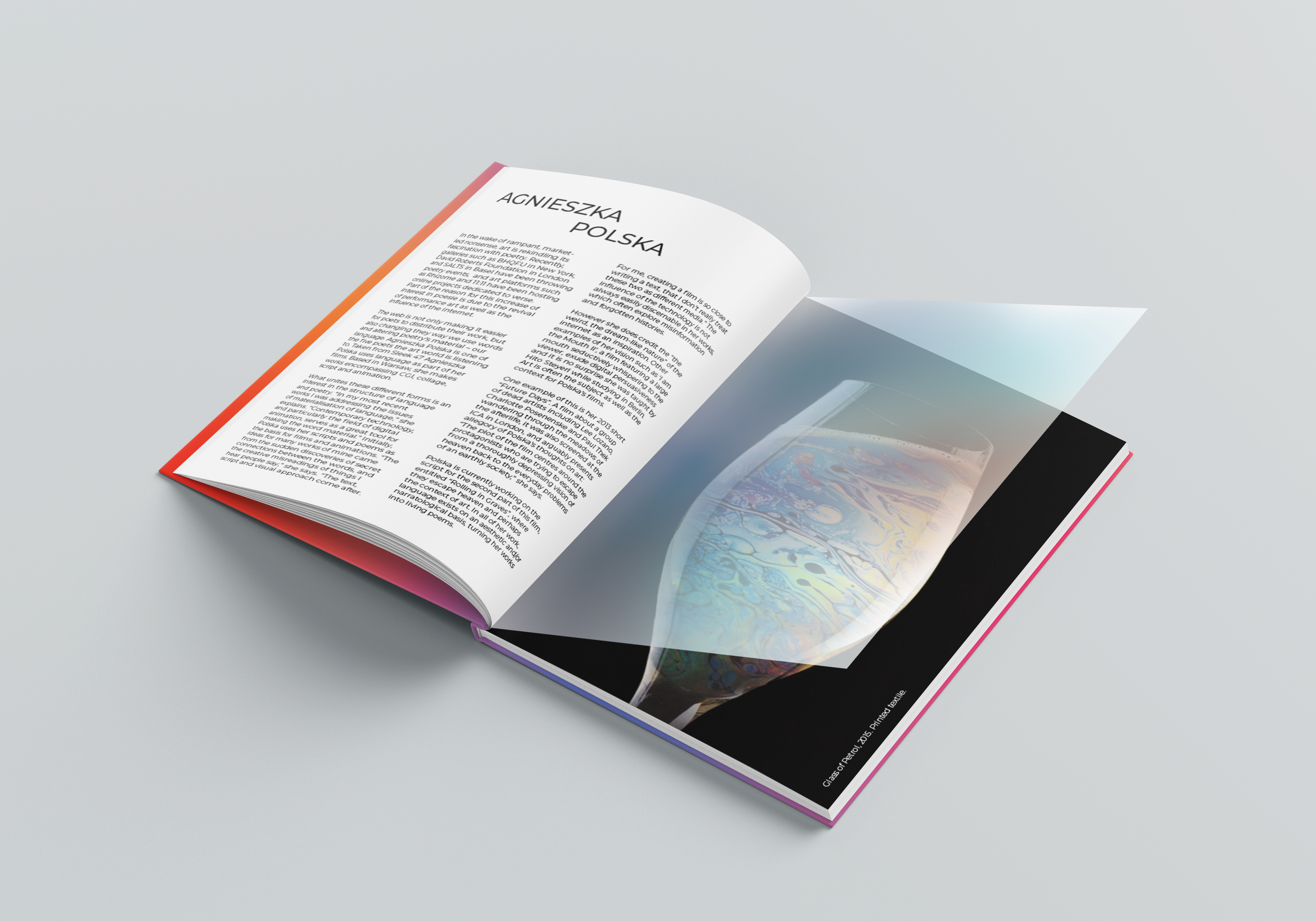
The third piece was a publication related to the gallery. I decided to keep the book as a whole more minimalistic in design, as the art in the biennale was more complex and contemporary. In keeping with the aura concept, I wanted to create various covers that used the background gradients from the posters.

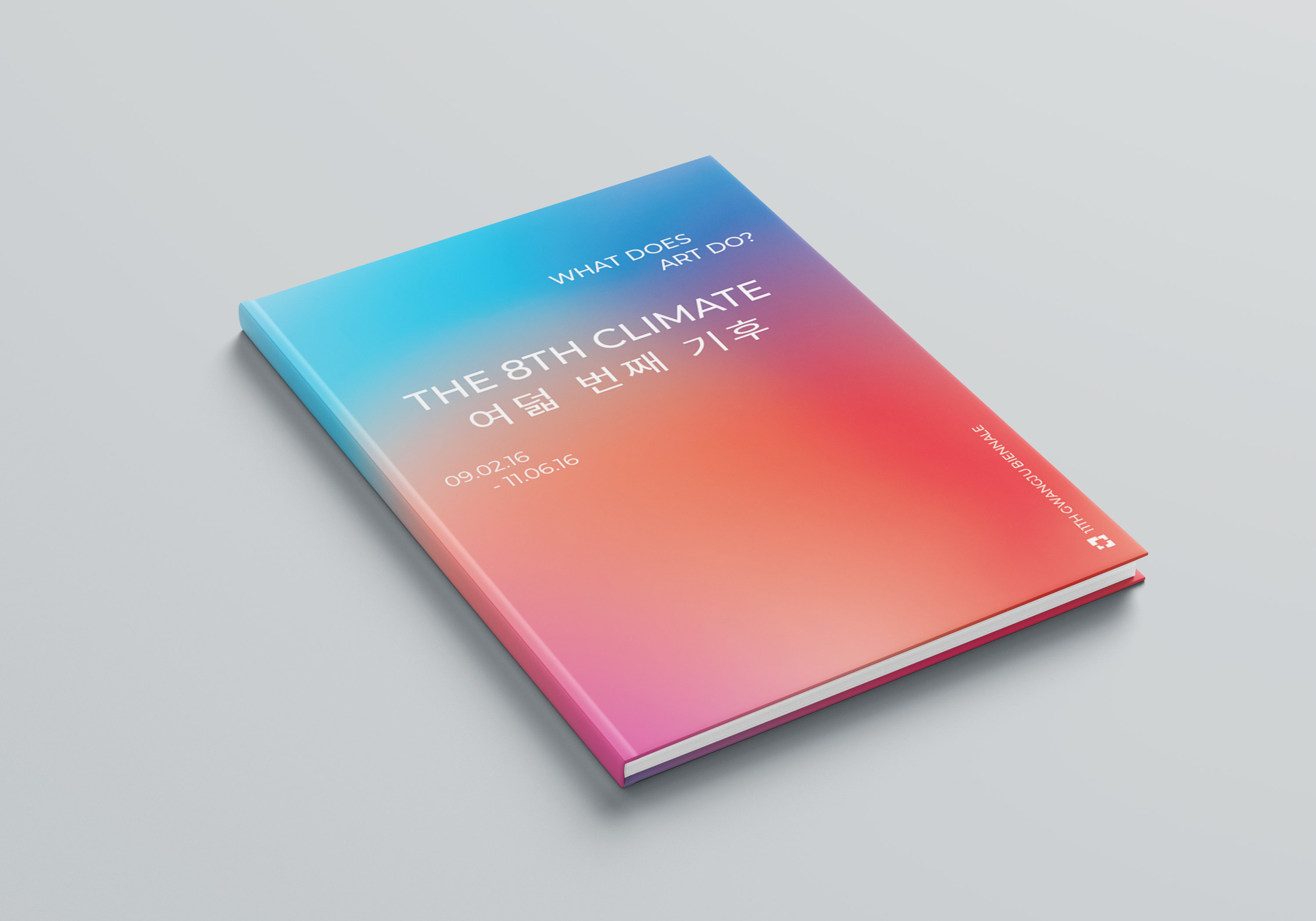
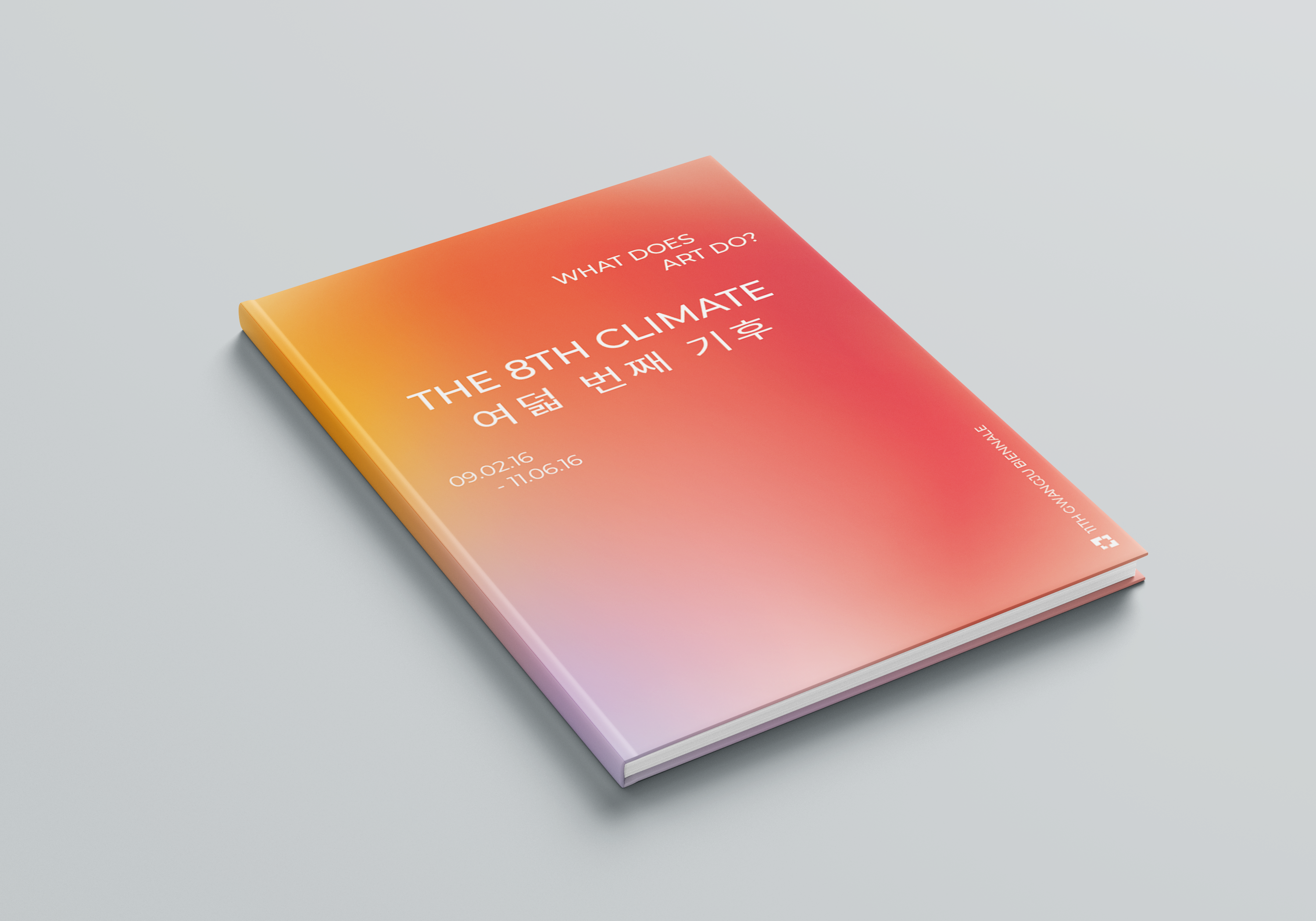
For the pages, I wanted to incorporate the idea of auras for the images. In keeping the design more minimalist, I was able to come up with a concept of a transparent insert in between spreads that would sample the colors from the images and blur them to create a unique "aura" for the artist pages.


IV. WEBSITE
The final part was to construct a beta website for the biennale. I wanted to create a very dream-like feeling to the website, so I incorporated a moving gradient background and hover effects. When you over over headings or images, they will both blur. For images, this blur will essentially correspond to the "aura" of the photo by abstracting the colors of the image. Hovering over an image also reveals the title of the work and artist. In addition, I added a snapping effect to the scroll so that the gallery of featured images has a cleaner effect. Finally, I tied in the 8 logo again by adding it as a cursor!
Unfortunately, since this was the last project, I did not have nearly as much time to work on this as I would have liked. If I had more time, I would have created sample artist pages so that when you click on an image or a name in the artist section, it will take you to a profile of that artist.
You can check out the demo website here or simply view the video below!


